Average(mean), median, mode are core statistical concepts, that are often applied in software engineering. Whether you are new to programming or have multi years of computer science experience, you’ve likely at some point in time will have used these statistical functions, say to calculate system resource utilization, or network traffic or a website latency. In my current role, my team is responsible for running a telemetry platform to help dev teams measure application performance. We do this by collecting point-in-time data points referred as metrics.

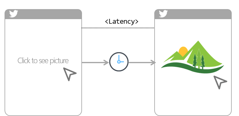
A common use case for metrics is to tell the application latency (i.e. amount of time it took between a user action and web app response to that action). For examples, amount of time it took you to click on twitter photo and till it finally showed up on your device screen. So if you have this metrics collected at regular intervals (say every 1s), you can simply average it over a period of time like an hour or a day to calculate latency. Simple right!
Well, it might not be that simple. Averages are bad in this case, Let me explain why.
Disclaimer: By no means I claim to be expert on statistics, so please correct me if I’m wrong. 😀
Why do averages suck?
Consider this:
- You have a code to measures how long a user waits for an image to render.
- You collected 5 data points over a period of time: 3s, 5s, 7s, 4s, and 2s.
- If you average them, you get 3.5 (i.e. ((3+5+7+4+2) / 5))
- However, 3.5 seconds is NOT representative of your actual users experience. From this data, it’s clear some of your users are having a very fast experience (less than 3 seconds ✅), and some are having a very slow experience (greater than 7 seconds ❌). But none of them are having a mathematically average experience. This isn’t helping
Are Percentiles better in this case? Yes!
Percentiles is a value on a scale of 100 that indicates the percent of a distribution that is equal to or below it. For example, the 95th percentile is the value which is greater than 95% of the all observed values. Coming back to our app latency scenario, instead of calculating the average of all observed data points, we calculate Percentile50 or Percentile90.
P50 – 50th Percentile
- Sort the data points in ascending order: 2s, 3s, 4s, 6s, 7s.
- You get P50 by throwing out the bottom 50% of the points and looking at the first point that remains: 6s
P90 – 90th Percentile
- Sort the data points in ascending order: 2s, 3s, 4s, 6s, 7s.
- You get P90 by throwing out the bottom 90% of the points and looking at the first point which remains: 7s
Using percentiles has these advantages:
- Percentiles aren’t skewed by outliers like averages are.
- Every percentile data point is an actual user experience, unlike averages.
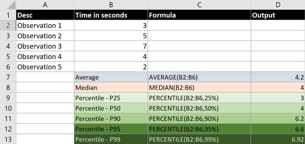
You can plot percentiles on a time series graph just like averages. And you can also setup threshold alerts on them. So say if P90 is greater than 5 seconds (i.e. 90% of observed values have greater than 5s latency) you can be alerted. Below is a spreadsheet to explain Percentile.

As you might have noticed, when you use percentile based metrics, you get a much better sense for reality.
Some interesting facts about Percentile
- Percentile are commonly referred: p99 (or P99, or P₉₉) means “99th percentile”, p50 means “50th percentile”…you get the drift.
- P50 is same as the median (mid-point of a distribution)
- And Percentile are NOT Percentage!
Conclusion
Now armed with some basic knowledge about percentiles, hopefully you’ll start seeing your metrics in whole different way.
Like what I write? Please join my mailing list, and I’ll let you know whenever I write another post. No spam, I promise! 👨💻
